EXHIBITION REVIEW: "A REVELATION"
by art critic Waldemar Sommer
Artes y Letras / El Mercurio Newspaper
Artes y Letras / El Mercurio (pg E4)
Sunday 16 June 2019,
Crítica de arte exposición 'Las tres dimensiones'
por Waldemar Sommer
'A REVELATION'
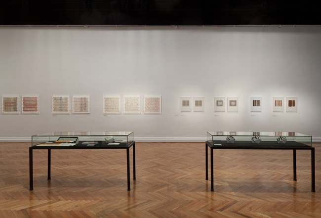
The work of Francisca Prieto (1974), a hitherto unknown on the Chilean art scene, is revealed at Sala Chile of the Museo Nacional de Bellas Artes [National Fine Arts Museum]. Shining forth is a unique and personal graphic style, a rigor of construction and a strong linearity together with delicacy of forms and refinement. Its allure is quite constant. It even attains unquestionably beautiful results. Once again, geometrical foundations pay lasting dividends among us.
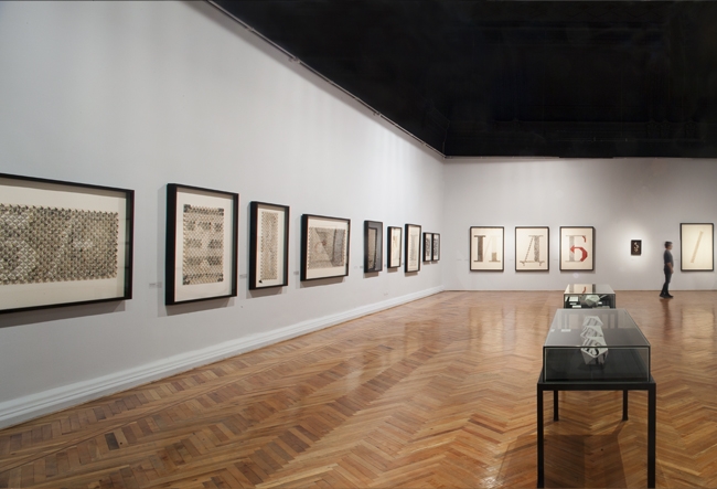
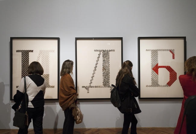
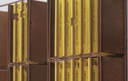
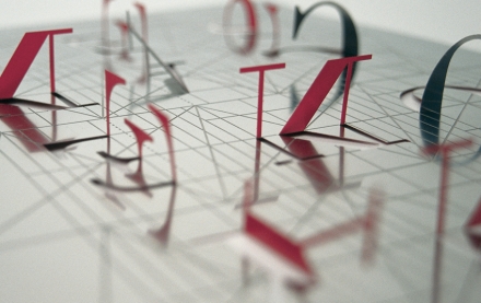
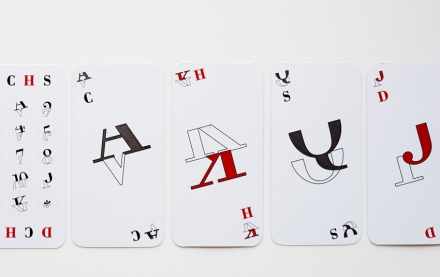
Based on the works exhibited, it might be fitting to establish four groups within the continuous development of this insightful London resident, based there for the past two decades. The earliest group - 2002 onwards and deeply informed by Russian Constructivism - displays typographical variations on the plane. Consisting of an interpretation of fundamental letters and numbers, or abridged playing cards, where grace coupled with a sharp sense of rhythm take precedence. There are ample silk screen prints and occasional metal incisions as well as polyhedrons featuring Parra’s Antipoemas. As the author herself affirms, she impregnates her intermediary British materials with Chile.
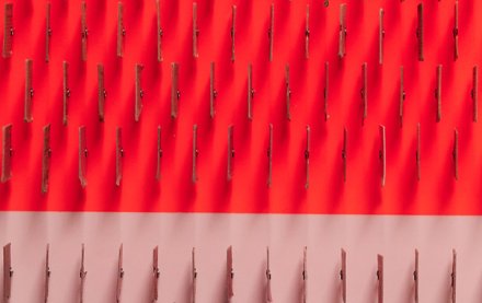
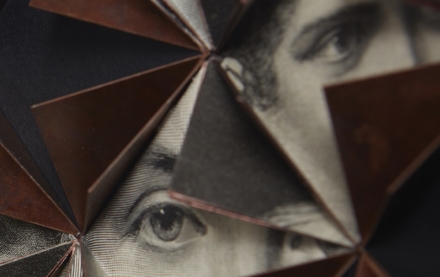
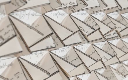
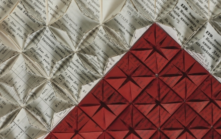
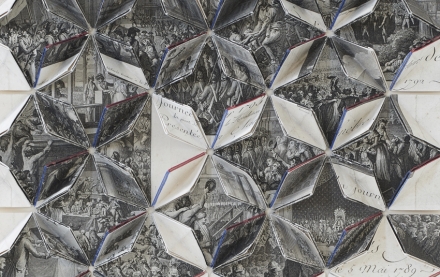
What follow are the genuine constructions of continuous, rigorous, refined and imaginative disposition of reliefs of folded printed paper. Kaleidoscopic forms of an open flower alternate with a bud that is on the point of bursting. Their physical origin are pages from antique British books, old catalogues with texts and illustrations. The themes range from tools or butterflies to nineteenth-century old characters and architectural facades of London. Black, white and greys frequently add monochromasia, unfolding a dynamic volumetric chiaroscuro. Within this group there is the very interesting addition of the use of copper alloys with metal, defining the thin edges of the paper, or threadlike geometrical volumes which reiterate on the base. The predominance in some of the colour black triggers the inevitable association - dust though art, and unto dust thou shalt return - with feelings of sorrow. Other works, using the same scheme of folded paper, allude to typography -Utopian Symbols- while a further four become, perhaps, quite elemental: Underlined.
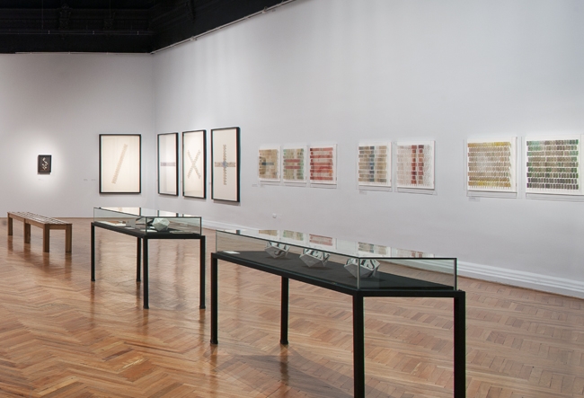
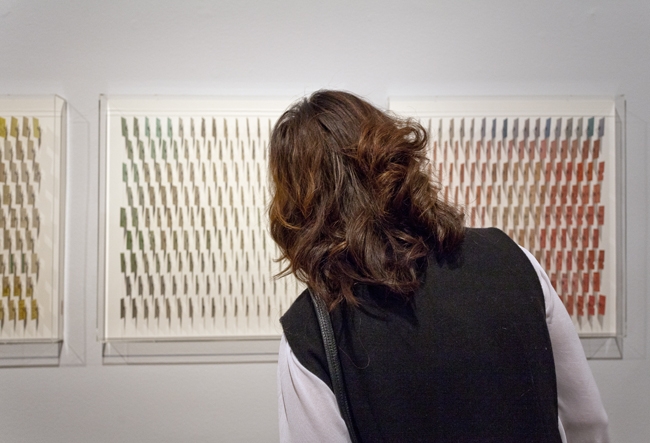
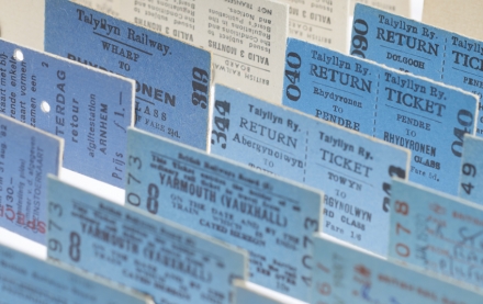
Colour, on the other hand, takes centre stage in the two-following series (2016-2017). These are exquisite creations, wholly executed using conglomerates of an unusual object: used Twentieth Century train tickets. We find them as single elements in the works of Intrinsic Dimension. They constitute an approach to Op art, by means of their own shadows on the base and changes observed as one moves around. They also transform into luminous variations, depending on the time of day.
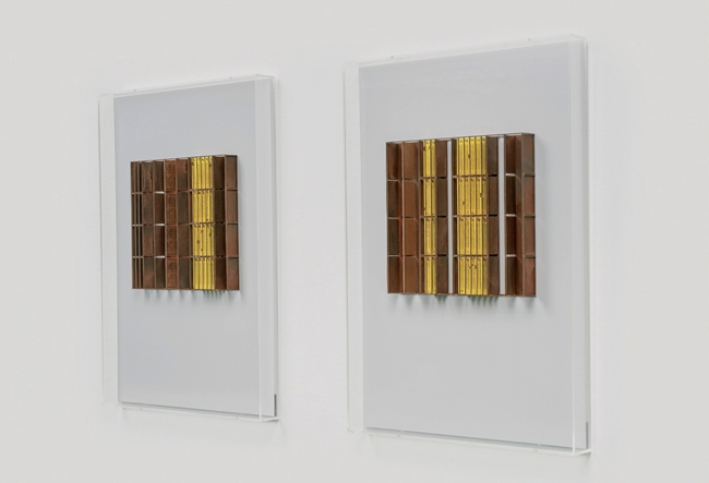
The final group, Reminiscence, draws on architecture, by bringing together the fundamental tickets and the now familiar very fine metal alloy structures. Here, the fine rectangular volume becomes more evident, making it possible to identify it with the facades of contemporary buildings. With themes found in London, Cuba and Chile - this, with prominent presence of copper - attains a monumental standing. Amalgamation (Venice Biennale) shine forth as particularly beautiful.
Las tres dimensiones [The Three Dimensions]
‘An excellent exhibition depicting the graphic development in Francisca Prieto.’
At Sala Chile - Museo Nacional de Bellas Artes [National Fine Arts Museum]
Until 4 August 2019
***
SPANISH
'Una revelación'
Hasta ahora una desconocida del arte en Chile, Francisca Prieto (1974) se revela en la Sala Chile del Museo Nacional de Bellas Artes. Brillan ahí una peculiar individualidad gráfica, un rigor constructivo y fuerza lineal junto a la delicadeza de formas y al refinamiento de trabajos, cuyo atractivo resulta bastante constante. Hasta alcanza logros de hermosura incuestionable. Una vez más, el fundamento geométrico vuelve a rendir dividendos perdurables entre nosotros.
A partir de las obras expuestas cabría establecer cuatro grupos dentro del desarrollo continuado de esta provechosa residente en Londres desde hace dos décadas. La agrupación más temprana —del 2002 en adelante y tocada hondo por el constructivismo ruso— despliega variaciones tipográficas planas. Consiste en intervenciones de letras y números esenciales o de escuetas cartas de naipe, donde prima la gracia y un agudo sentido rítmico. Si constituyen amplias láminas de serigrafías impresas u ocasionales incisiones en metal, hay también poliedros con Antipoemas de Parra. Como lo afirma la propia autora, ella impregna de Chile a sus intermediarios materiales británicos.
Vienen después las genuinas construcciones con papeles plegados de acuerdo a una regulada, fina e imaginativa disposición de relieves continuos. Alternan las formas caleidoscópicas de flor abierta y de capullo a punto de reventar. Su procedencia física son hojas de libros ingleses antiguos, viejos catálogos con textos e ilustraciones. Abarcan una temática que va desde herramientas o mariposas hasta personajes decimonónicos y fachadas arquitectónicas londinenses. Negro, blanco y grises suelen añadir monocromías, desplegando un dinámico claroscuro volumétrico. Dentro de este grupo tenemos la muy interesante integración de aleaciones de cobre con metal, definiendo ya delgados filetes en los bordes del papel, ya volúmenes geométricos filamentosos que se reiteran sobre el soporte. El predominio del negro en algunos provoca la asociación inevitable —Polvo eres y en polvo te convertirás— con sentimientos luctuosos. Otros trabajos con el mismo sistema de papeles plegados aluden a tipografías —Símbolos utópicos—, mientras otros cuatro se tornan, acaso, demasiado elementales: Subrayado.
El color, en cambio, se impone protagónico en los dos conjunto siguientes (2016-2017). Corresponden a realizaciones exquisitas, efectuadas enteramente a través de conglomerados de un objeto insólito: boletos usados de trenes del siglo XX. Los hallamos como elementos únicos en las obras de Dimensión intrínseca. Conforman un acercamiento al op por medio de sus propias sombras en el soporte y por los cambios causados por el desplazamiento del observador. Asimismo se transfiguran en variaciones luminosas de acuerdo a las horas del día.
El último grupo, Reminiscencia, aborda la arquitectura, unificando los capitales boletos y las ya conocidas estructuras muy delgadas de aleación metálica. Acá el delgado volumen rectangular se hace más evidente y permite identificarlo con fachadas de edificios contemporáneos. De temática obtenida tanto en Londres, como en Cuba y Chile —este, con presencia destacada del cobre—, alcanzan rango monumental. Entre ellos, Amalgama (Bienal de Venecia) luce especialmente bello.
LAS TRES DIMENSIONES
Excelente muestrario de desarrollo gráfico en Francisca Prieto
Lugar: Sala Chile del M.N. de B.A.
Fecha: hasta el 4 de agosto 2019